

The career website is the face of the employer which will be dialoguing with potential candidates. According to the work of Potentialpark, a global employer branding research firm, career sites are not only the most used channel by candidates, with 88% in France, but also where the information is perceived as the most credible. It is therefore essential that it is well thought and constructed in order to hack a maximum of talents. So how can one design the ideal career website?
The Basics

According to Potentialpark, a company needs to enhance a few elements for its career site to be a good one. The UnderCoverRecruiter has listed these in its article.
- Usability – the career site needs to be user friendly. The candidate must perfectly visualise where to click in order to access the section of his choice, and the navigation needs to be smooth, clear and instinctive.
- Employer Branding – you need to differentiate yourself and give the candidate what he wants. Selina Kerley lists in her article the following ideas:
- An employer video
- Staff testimonials
- Office photographs
- Company benefits
- Social media links
- Direct contact information
- Talent Relationship Building – you need to make sure you do everything you can on your career site to cultive ties with talents who may join your company. This needs to start early. Promote your summer internships opportunities to hack talents early and create a talent community on social networks and invite people to join. You need to advertise a great environment people will want to join.
- Application Management – applying for a position must not take more than 10-20 minutes, or you’ll look inefficient and dull. Instead, prefer a quick, direct and effective system treating well the candidate. Automatic replies are for example always well perceived by the applicants.
- Recruitment Process, Assessment & Individual Feedback – process the applications fast and efficiently. The ideal length ranges from 1 to 2 weeks. Another point to focus on is communication. Keep the candidate updated on the stage of his application and give him/her as soon as possible a polite feedback, even if his/her application was rejected.
Lessons from the best
Potentialpark is producing OTaC Career Website Rankings which measure the ability of an employing entity to run a career site meeting the expectations of applicants. Let’s take a look at the podium of employers in France. Here are the 10 best performers.
- Deloitte
- PwC
- Armée de Terre
- Orange
- Groupe Crédit Agricole
- AXA
- Carrefour
- Allianz
- Accor
- Société Générale
Looking at this ranking, the French website RMSnews has drawn some nice ideas from it in an article . Click on the link and you’ll get real illustrations of these ideas. Yet, here are synthesized some of those good tips to improve your career website:
#1. Make the applicant discover
- the company:
- with pictures;
- with videos;
- through 3D visits (e.g.: Crédit Agricole);
- via a game (e.g.: La Poste);
- by focusing on the human, presenting the collaborators;
- by promoting the corporate culture and integration. Show how onboarding is realised, as Deloitte does;
- on social networks such as LinkedIn or Facebook;
- and of course in different languages in order to attract international applicants;
- the jobs:
- with video presentations of the jobs;
- with description cards of the jobs;
- those can be extremely detailed, like Orange does.
- by giving the contacts of some collaborators doing this job, like PWC is doing it;
- by putting the candidate in the shoes of a collaborator, as a hero: a creative idea implemented by AXA;
- by showing evolution is possible and what the opportunities of advancement are once you get the job;
- or even through quizzes like Accor;
- by being transparent: make sure to be straight forward and to always be honest. This is what the career site of the French Land Forces has decided to do. Candidates like to be told the truth. And for that, they’ll trust you.
#2. Help the candidate apply
- coach via a section dedicated to tips, like Accor;
- explain how the application process is working, with an infographic or scheme, like Allianz and Mazar.
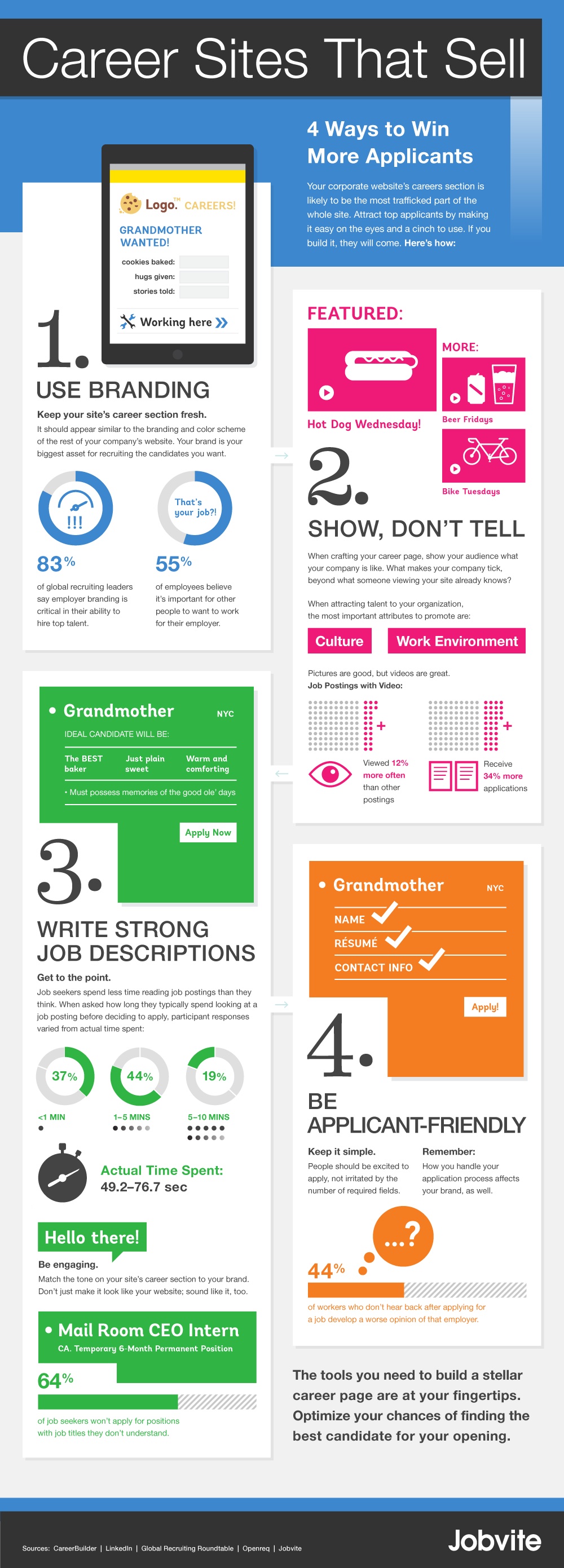
Here is an infographic by Jobvite which summarizes some essential tips to create the ideal career website.
Time to adapt to the 21st century
[Tweet “It is time to adapt your career website to the 21st century”]

#1. The career hub
The French career site of Colas is very visual and user friendly. It is called a “Career Hub”. It is a new sort of portal 100% mobile and aggregating digital content. It federates all the company’s sites and social networks. Not only is it centralising content, it also centralises access.
#2. Facebook, career site of tomorrow?

It is true that Facebook presents non negligible assets as a career website. First of all, it is fulfilling many expectations of the candidate. It enables a company to adopt a human tone and to be authentic. All this allows the firm to communicate on its values, which helps the candidate in his decision making. Moreover, Facebook makes it easier for the employer to access a larger pool since this social network has more than 1 billion users worldwide. Not to mention that one usually spends at least 1 hour a month on it, versus 10 minutes for LinkedIn. Of course, this amount of time is nothing compared to the frequency of use of Generations Y and Z. So this is getting better and better. Finally, companies can pay to access more features and develop their career page on Facebook. In the end it is always cheaper than running a traditional career site.
So clearly, there are advantages in using Facebook to create a career page, instead of a website. Yet there are quite some matters which need to be addressed. Having a career page on Facebook and not a website means that a company needs to trust an external autonomous platform, Facebook for instance. There are therefore a loss of control over it and uncertainties that the company needs to understand. And careful, a Facebook page can’t be used as a traditional career website in terms of tone: it can’t be the cold standard one. On the contrary, the page needs to be made collaborative, with many collaborators sharing experiences and stories.
In the end, the wisest choice might be to own the 2 entities, since the career website, with all its features remains essential, whereas the Facebook page can be a bit limited. The Facebook page could be some sort of outpost, a simple bridge between the Facebook community and the career website. This is what Ernst & Young has decided to do.
#3. Go 100% Mobile
A PotentialPark study has studied mobile versions of career sites in France. It appeared that the number of candidates wishing to apply from their mobile for a position has dramatically increased: they are now a quarter of applicants. PotentialPark is expecting this ratio to increase in the years to come, with more and more companies making their career sites more mobile friendly. And this number of firms doing so is increasing too! Out of 126 surveyed companies, 57 had a mobile version when it was only 27 in 2014. A few basic tips to follow are to include a lot of full width images and other digital content, to adopt a vertical structure to make it easier to scroll on a mobile and to implement swiping functionalities to go faster.
[Tweet “Your career site must be 100% mobile or will never be!”]

Conclusion
So your career site needs to be user friendly, visual and clear. It needs to centralise both content and accesses. Finally, the requirement of our times is to make it 100% mobile friendly.


Leave A Comment